For artists and collectors sponsored by Intercal...your mohair supplier and Johnna's Mohair Store
 English-speaking community!!!!Ladies and gentlemen!!
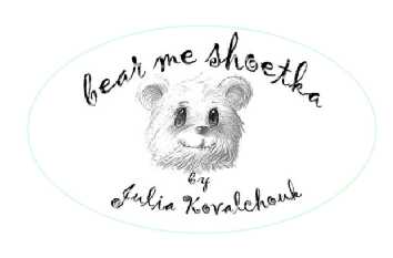
Guys, i need you to hear your opinion. Here is my new logo for my bears. It means (well, bear, I guess everybody understands![]()
"me shoetka" it's a one of the bears callings like teddy. Mishka, Mishootka, Mikhailo Potapych.....
So, how does it sounds?? Is it difficult to pronounce??
I really appreciate your participation, thanks in advance.
Hugs, Julia. 
Hi Julia. I'm from England. Guess our American, Canadian cousins are still in bed! It reads to me like me shoot-ka? If thats right its pretty easy to say and understand. The shoe bit makes it easy. I like the old fashioned writing and sketch. Good luck.
Its hard to think on a wet Sunday morning her in England there are some of you still in bed ready to wake up later to glorious sunshine!:rolleyes: It is already dark here now at 8.30 pm. Whats it like where you are Julia?
Hi Julia,
I agree with Amanda. It reads like shoot-ka to me too. And your logo looks great!
Hey, I'm up...and it's only 4:44 a.m. or thereabouts. I like your logo...is that your own drawing? It's very cute. It looks like "me shoetka" to me...but what do I know...it's too early and I haven't had my coffee yet.
Shantell
Hi Julia. I read it as shotka and it not hard to say. Are you going to let the design in black and white or will you add colors?
Hi Julia,
Your logo is cute !! did you draw the bear by your self ? so cute! and I like the sound Me Shoetka ♪
Ваш логос очень cute! Я люблю его.:D ( I'm just trying here.. hehehe)
Hugs/Marie
Hi Julia
I like it and here's why;
While you are marketing to the world, you are also keeping your Russian heritage
Me Shoetka is easy, catchy, and sitll 'ethinc'-as in Russian
The drawing is adorable
the whole effect is elegant
the whole effect is simple
Very good....
all right to the Americans in their 50's who else had this thought while studing the card:
I saw Mishka Mishootka-and what pops in the peabrain:
Meeska Mooska Mouskateer.....Mouse cartoon time now is here....
Yikes! the stuff that is in there! Its scary!
scarybrain hugs
Dilu
I like the bear, he looks great! The text is hard to read though.
Hi, Julia . . . is the pronunciation of shoetka - shootka or shetka or shotka or shoatka? Whichever it is, it will be easy to pronounce once we know HOW to say it. I like your drawing of the little bear . . . did you do it? If so, you are quite the beautiful artist!! So when you translate the saying, does it mean . . . . "bear, my teddy", or "bear, the teddy, or "bear and teddy" or something like that? Sorry, I'm so curious about the meaning/pronunciation of the words.  Anyway, I like what you've done with it!
Hi Julia,
I like your little Bear logo - ever so cute.
Also neat that you have used your Russian language as we need that cultural diversity.
Hugs
Carolyn
 Ohh, I'm sorry for keeping silence that long. I've been out of internet for 3 days.
Well, love to hear all your responds.
Yes, it pronounce as shoot-ka but I thought to write it as shoe would be more familiar to pronounce.
Yes, I draw it myself and that wasn't the hard one.
As for translation. Michael, Mikhail (by the way, it's my Dad's name) is a common Russian man's name. And short for Makhail is Meeshootka. Like Teddy for Theodor. The word "bear" in Russian sounds Meeshka. And short for it is "meeshootka" ( at least one of it's callings). So, it could be translated as "Meeshootka the bear".
Every teddy should have one's name.
And I'm sure if the logo was pronounced fine MY NAME wasn't . So of course my maid last name was much more easier but...I have now another name. (should've married Amarican)
Thanks again, Julia
Thank you SO much, Julia, for the explanation! You are a wonderful artist, my friend!
I love the logo, name and bear. I also think the text may be a little hard to read. I had to read it a few times, to make sure I got all the letters right. I like scrolly text, but with an unusual name, a simplier font may be easier. BUT then again I like it the way it is also!....:P
 :D I love the logo! Simple and clean and very memorable.
I'd definitely use a simpler font, though. It makes the unfamiliar names easier for English speakers to read.
Eileen
Julia:
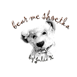
Love your Logo and what a beautiful artist you are. I found the second pic easier to see and read.
Kirsten, Eileen, I really like this font. I tried all fonts in different styles and this one has the neatest look. Simple fonts look a little rude (not sure if it's a right word).
Sue Ann, Jo-Ann, thank you. My mom said my logo should look more "my style" with character not just a simple bear drawing. I used my one of my bear's pic on the second logo.
Julia.