Banner Sponsors


For artists and collectors sponsored by Intercal...your mohair supplier and Johnna's Mohair Store
 Posts: 1,836
For those that have advertised in magazines are there any basic do's and don'ts? What shows well in print and what does not. Are there fonts to steer clear of or is it all just preference? I'm hoping to advertise for the first time and obviously want it to be good from the get-go 
I'm looking to keep it clean and to the point, but outside of that I'd like some feedback.
Thanks so much!!
:hug:
~Chrissi
Hi Chrissie, 
I've only advertised in one magazine so far.....for the TT issue of TB&F. I let them do all the work on the ad and just supplied the picture and basic information. I was absolutely delighted with my ad. It does take a leap of faith but my reasoning for having them do it was two fold: #1 They want to do the best job possible for you so you'll advertise again. #2 I didn't have a clue as to what I was doing and I believe that if someone else has the knowledge to do something better than you can......pay to have it done!
I'm sure that whoever you're advertising with would be happy to guide you and answer any questions you have. Good luck!! I look forward to seeing your ads.
Warmest bear hugs, :hug:
Aleta
 Posts: 119
As a graphic artist I can perhaps shed some light on your question. Frankly it just isn't simple, that's why we need to take years of classes.
First, perhaps is you really should buy a color wheel and understand color opposites. There is a reason that red and green are christmas colors... they fall opposite on the wheel and stand out real well against each other.... like blue and yellow.
There are an infinite number of factors, hue- shading- tint- brightness... then of course you need to fit in your most important 5 Wh's (who-what when where why... sometimes how) into your ad so its functional as well as pretty.
when it doubt look at other ads, usually its the simple thats the best... too much turns into a mosaic.
I would recommend finding someone you trust to help with design, or even the people at the magazine... as time goes on you might tweek and tweek too.
the simple answer to your question is that it is um complex?
gee that was a load of help huh?
articicle
Posts: 119Not to pick on icons... and this is only speaking currently, as the icons might change as someone reads this days, months, years down the road...
look at my articicle red lettering on the green background... se how it "pops"? Now look closely at the word "happiest" in your logo... notice with the bear backing of white the piest sticks out far more than the hap. Moreover my lettering is shaded and angled. The design of my logo works the lettering with the line of my arm and shoulder and the tilt of the bear for a more dynamic eye catcher.
Does this make sense? Light words on dark backgrounds or vice versa rather than dark on dark or light on light. Font size large something key to pull the eye in.
articicle
Posts: 1,836Thanks Aleta I was thinking of going that route but wanted some extra feedback..I've seen your ads, they were very eye catching and memorable. Clean, very clean visually.
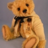
Thanks Articicle, I actually have a color wheel and have a pretty good understanding of colors on the wheel. I think it's a must have basic in a studio. My avatar won't represent a future ad at all..good grief no! I threw that together in literally 10 minutes one day just to be festive! 
:hug:
~Chrissi