For artists and collectors sponsored by Intercal...your mohair supplier and Johnna's Mohair Store
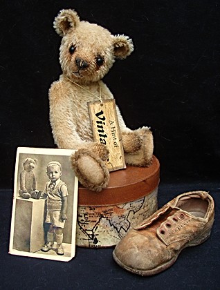
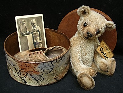
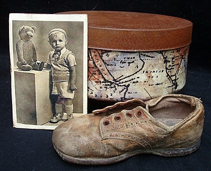
 I've created a little vintage set and can't decide which photo to use on my website description. The set consists of the bear, an old-looking box with rusty metal lid, a vintage photo of a child that I've "aged" (didn't age the child, but the photo), and an OLD child's shoe (the shoe is old, not the child). Well, I guess the child that wore the shoe would be really old now. But, I digress. Which of these two photos do you like the best?
# 1.  or
or
# 2. 
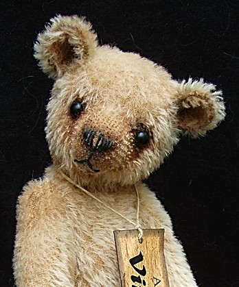
One of those along with the close-up and this shot of the accessories will appear on the website.

I would be ever so grateful for your opinion and thank you much for taking a look. :hug: :hug: :hug:
That's adorable and that's a tough choice, but I like the second one.
I personally like the first photo. It feels more simple. You eye goes to the bear, where as my eye goes to the box with the shoe and picture first in the second photo. I don't even notice the bear.. again, my opinion.
Great bear, btw. 
Number 1 is my favorite. 
I also like the first one because the bear is more prominent- the second one is too busy for my liking
Great photography Sue Ann
Hugs
Gail 


I prefer the first one.I agree with Tanya-- It has a triangular look which draws your eyes up to the bear making him the more prominant and important item in the picture. where the second picture the eye is drawn more to the box and old picture with the bear seeming more a secondary item.
A great set and a marvelous bear!
Beth
No1 for me as well.
What a gorgeous bear and No 1 works for me, your eye goes straight to the bear 

I like the first one, but as the bear is just so sweet I don't think it will matter which one!!! Hugs, Susan. 


What a beautiful set. I think I prefer the first picture. You get a better view of all of the items.
Wow, guess I'm out-numbered. But you are right, both are darling photos and I don't think it would matter.
I do appreciate your responses, folks, and definitely will use the # 1 selection. Marlys, even though you were a minority of one, I value your opinion, too, my friend. Judd, by the way, is 9 1/2 inches tall. Thanks to all of you, also, for your kind comments on the set . . . it was fun to create. :hug: :hug: :hug: :hug: :hug: :hug:
It is a wonderful set! I think this adorable little bear will find a new home quickly! 


Love this sweet aged bear sue Ann....and all the great props make the display really special 
He's a handsome fellow! That first picture also shows his shape better! Someone will be a lucky mom to have him!!! Fantastic job! :clap:
The first photo is better. The bear and the items are displayed nicely. Lovely bear! 
beautiful, what a totaly gorgeous bear x
:clap: :clap: :clap: great little vignette - and cute as heck bear :clap: :clap: :clap: (and my vote would definately be pic #1)
What a cutie! He looks so hugable and well loved. Both photos are wonderful. But I agree that number one is a better display of the bear.
Love everything about this set, fabulous bear 
 I also love pic number 1
Pauline
Against the flow, here, but I would select photo #2. 'Bear' looks like he's in the middle of something important and is inviting us in to take a look. Adorable.
Beautiful bear with great expression  ( No 1
  )
)
Olga
I really really like this bear Sue Ann. He has such charm. I agree, #1 seems to draw your eye to the bear first, and he is looking straight on. Either way I wish I could be his new mom !
First off what an adorable set 


I love the second picture :hug:
I really appreciate all of you taking time to look at and vote on the photos. And many thanks for the very nice comments on the set . . . I welcome all feedback. :hug: :hug: :hug: :hug: :hug: :hug: :hug: