For artists and collectors sponsored by Intercal...your mohair supplier and Johnna's Mohair Store
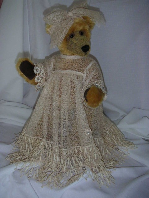
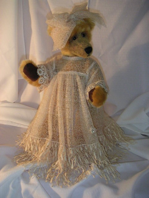
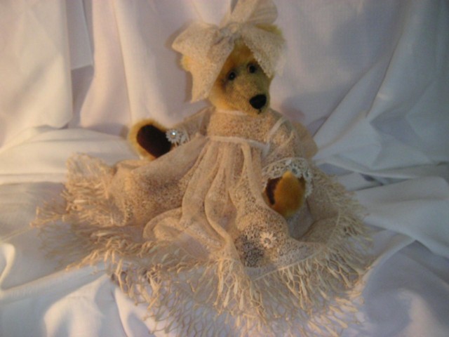
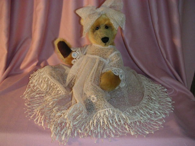
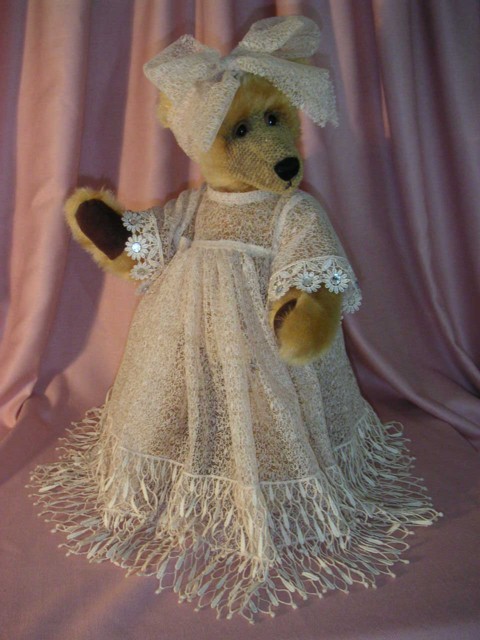 I would like to know what pics is better as i have tryed so many colours ,first its to dark then its to light ,and because most af my dresses are cream the light back ground dose not show up the dress and the dark background is to dark
  than i put a light on then i take it off again,What do you think.Just wondering what you think .
Hi Fran, I like the first one as the background doesn't distract me from the gorgeous bear and outfit. I also think the colours are best, and it really shows me her amazing gown.
Hope this helps!
Danni
Hi Fran,
Now I'm just going to confuse you (LOL!) but I like the second one the best because it shows up her face the best, without any shadows. I still think you can see the lovely detailing in the dress as well in the second picture. That's my vote!
Hugs,
Brenda
I like the very last picture the best. It is very complimentary to both the bear and the beautiful dress.
They are all excellent pictures, just the last one seems the most flattering for both!
Hugs, Kathy
The last one is the one with do light on thats interesting
Hi Fran!
I'm with Brenda.... You can really see her sweet face in the 2nd photo and still see the detail in her lovely dress! When I first looked at the photos real quick (before I read your post) my first impression was liking the first 2 photos more than the others... because of the background color.
Top two. Like the mauve background.
I like the pink background too. I think I know what's not quite right as I had this problem. Is it mainly lit from the left hand side/front? I had this. Still do to a certain extent. You need a light above and from both sides. Shelli pointed this out when I asked for advice. Its hard work getting it anywhere near right. Good luck from someone still trying!
Hi Fran...for me the second picture. The detail of the bear and her beautiful dress shows up so much better in this picture.
Jane 
The second one. Shows the detail of the dress and the expression on her face. the background doesn't allow the dress to blend at all with it so it shows it off well.
I was told by a photographer friend that you should never photogragh pale colours on white as you lose detail.
I like the first one..Shows a dress best for me.. 
I like either the first or second, and definately the pink background. It shows the dress better.
Wow, Fran, Lots of different opionions here.
I like the first photo as it shows her dress and contrasts nicely with the background color.
My only suggestion would be to maybe use some filtered light . It will eliminate harsh shadows. If you added just a touch of light to the right side of the first photo it would show her beautiful face even more. I sure hope you don't mind my suggestion. :hug: :hug: You bear is really lovely!
I like the first.....and the second....... :dance: 
Nice bear, and amazing dress!!
I'm with everyone else, I like the 2nd picture the best!!
I like the first and second pics with the mauve background.
P.S. My 3-year old just saw it and said, "That's a pretty bear. She's like a pretty princess."
Picture one Jazzylady
very elegant as befitting any diva wearing one of your gowns!
hugs
dilu
Thanks to everyone i know what to do get another light to start with and stay with the pink